Rebranding RiverStone International
Working with a new business or a business going through change is what we do. Our work on branding must always be relevant; it must differentiate a business from its rivals; it must have impact; and it must be implemented consistently.
Branding must be a visual expression of what a business stands for.
Our recent work in the insurance sector includes the launch of both Convex and Conduit, and the bifurcation of Fidelis. Having worked with insurance brands for more than 20 years we know the market, so we were delighted when RiverStone International asked us to look at their branding after the exit from Fairfax ownership.
The task was unusual because the US business of RiverStone remains part of Fairfax and continues to use the existing branding. We had to differentiate the international business from the US business whilst creating branding to reflect the newly independent status of our client.
As with any branding project, we encouraged RiverStone International to stand back and take an objective look at their business. We interviewed key decision makers to get a clear picture of the business and its place in the market. We then hosted a workshop to interrogate and distil everything we had learnt. The results guided our subsequent work.
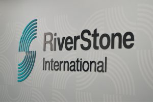
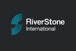
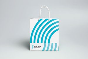
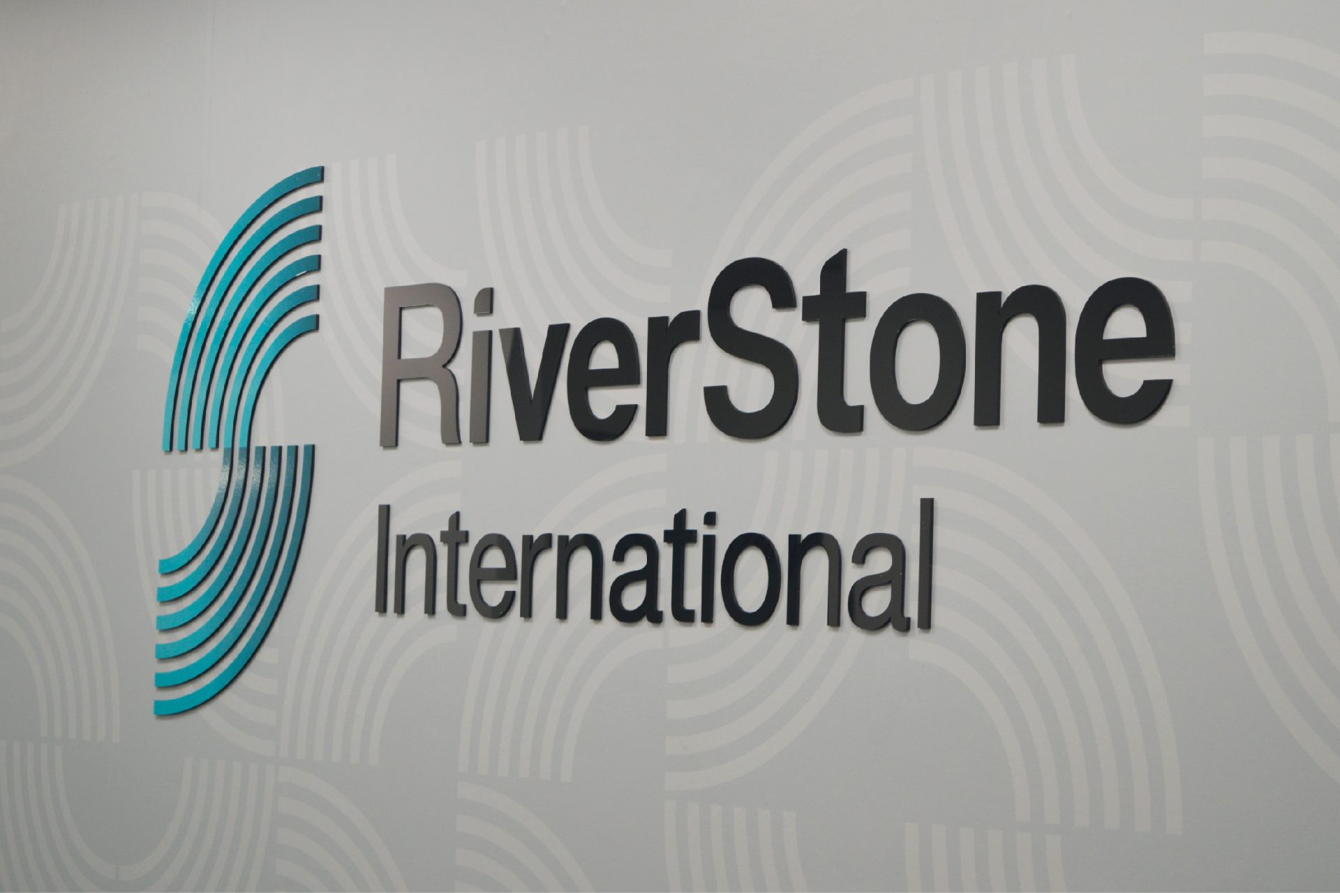
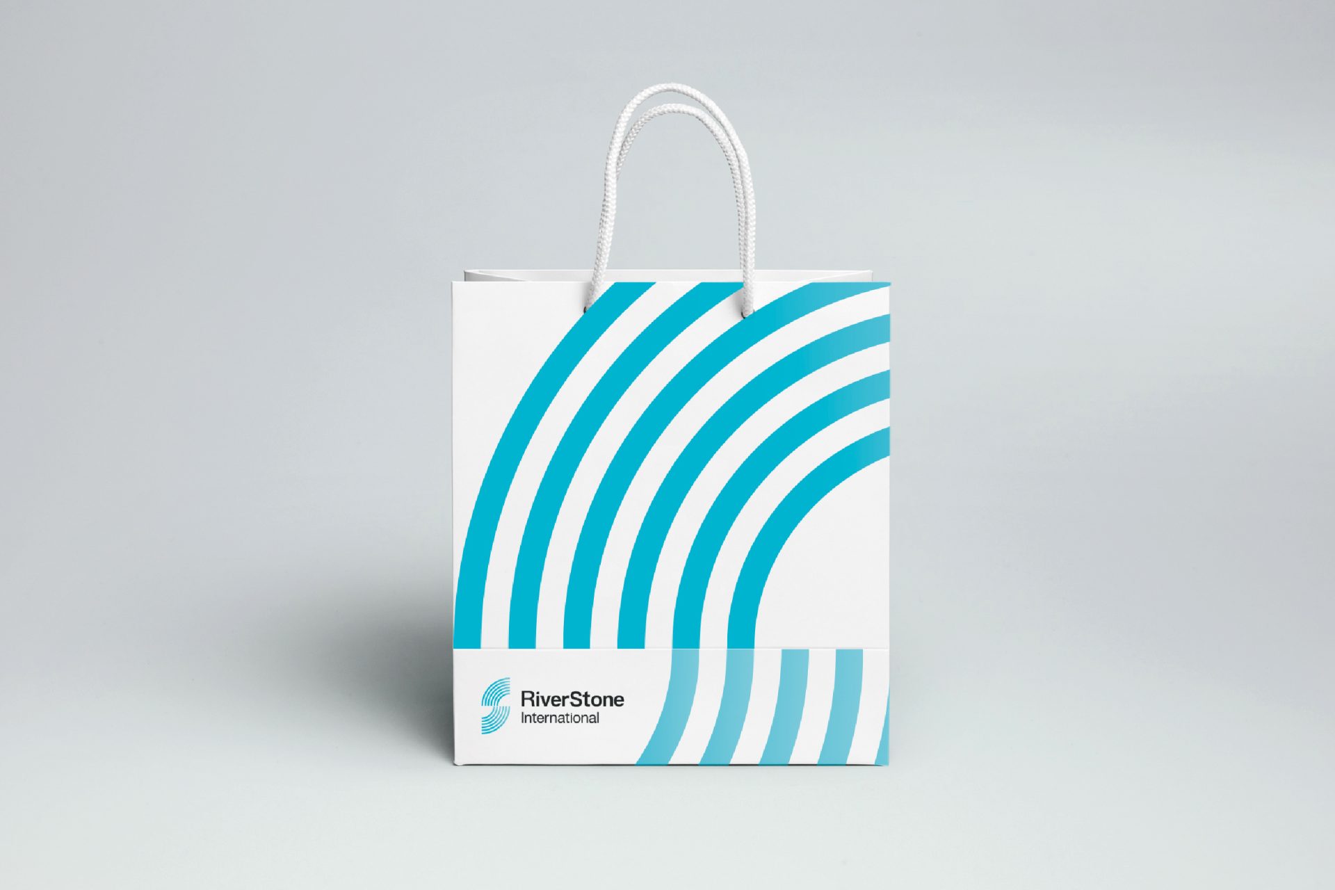
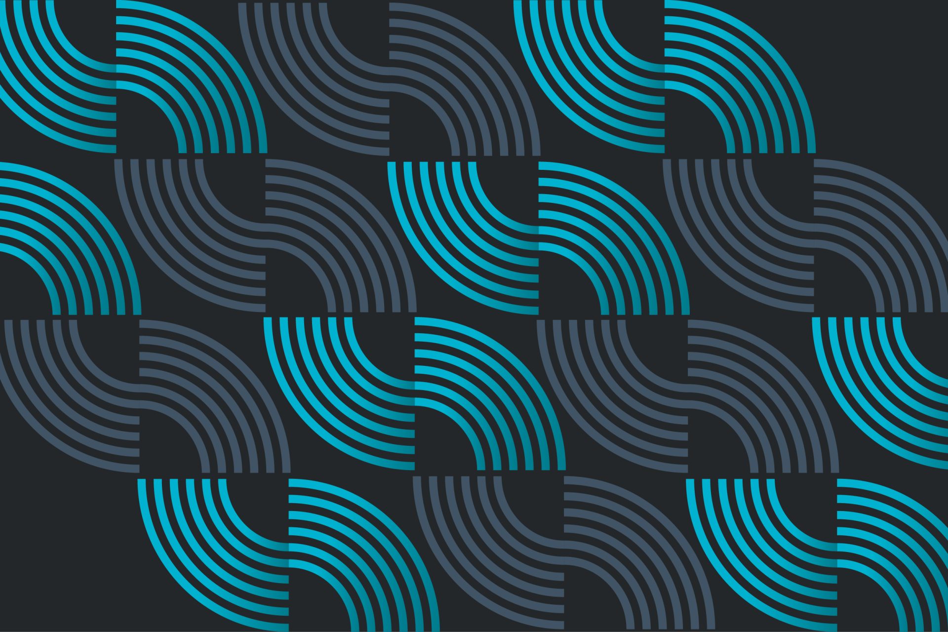
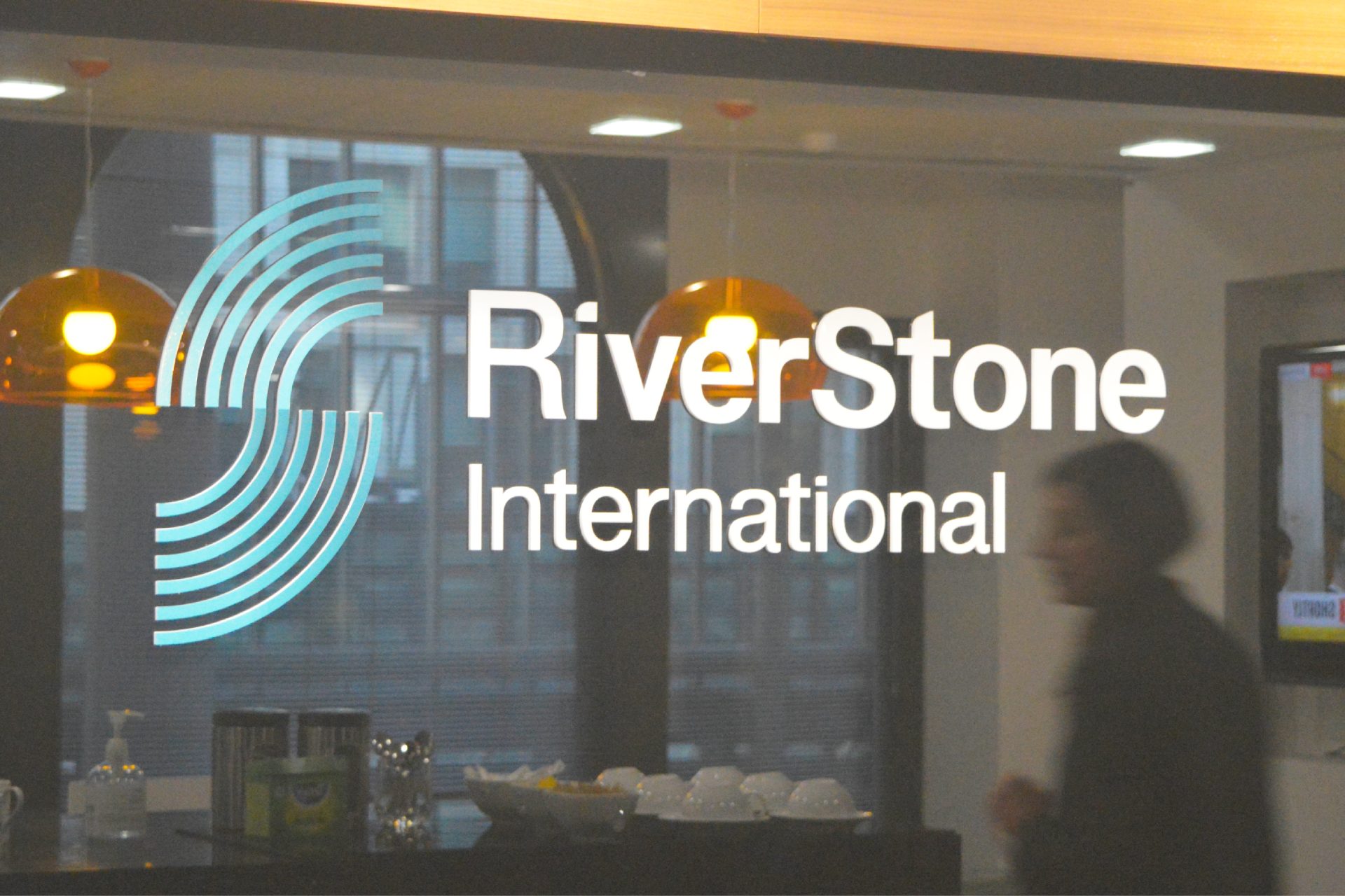
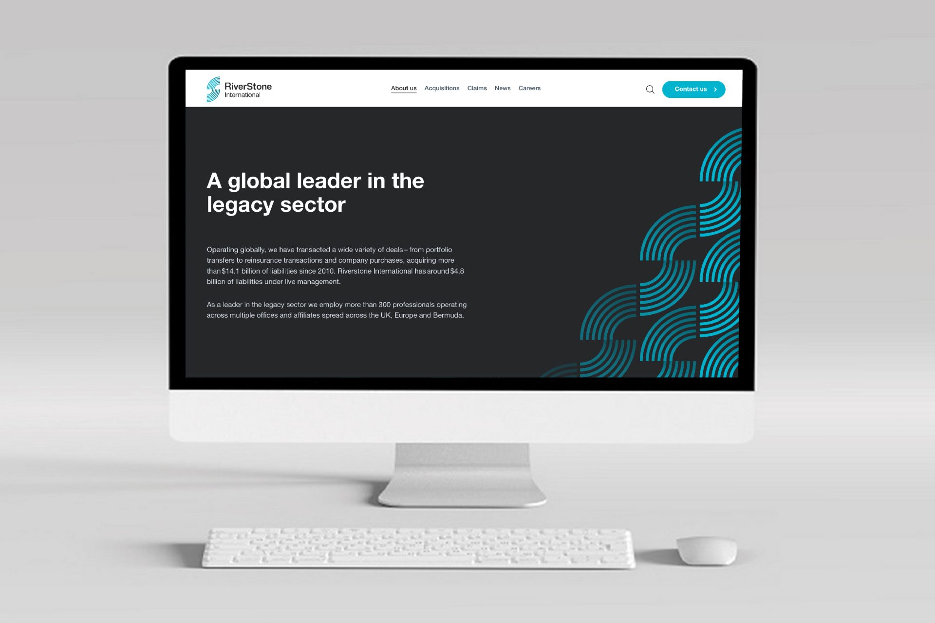
We designed a new logo to establish a clear visual break with the past and to embody RiverStone International’s values – fair, friendly and trusted.
The new symbol – a pair of Rs (for river) linked to form an S (for stone) – suggests the flow of water and represents RiverStone International’s newly acquired freedom to make decisions independently and swiftly. The use of the symbol as a graphic device underlines this liberation and reflects the collegiate culture of the business – as does the light trail photography we selected to support the new branding.
* We provided design guidance only on the website


Our relationship with Haggie Partners goes back several years and for this reason, when we decided to appoint a partner for our rebranding project, we trusted their design team.
The rebranding work started with a very comprehensive discovery phase which helped us redefine our core values and build the foundations for the design work. The result, a brand-new visual identity that truly represents our ethos, brings our vision to life and establishes a clear break from the past.
It’s been an absolute pleasure working Michael and Gavin. Their creativity and guidance throughout the process has been invaluable. They worked collaboratively with our web developer and template builder, providing strategic input and guidance for the delivery of all digital assets, marketing collaterals and office rebranding.
The dedication, attention to detail and knowledge demonstrated by the team were instrumental in the delivery of our new branding. I look forward to continuing to work with Haggie on brand development as our business evolves.
Federica Aversa
Global Brand and Communications Manager