


Repositioning Brokerslink
A chameleon brand
Brokerslink needed to strengthen its brand and emphasise its position as a genuine alternative to global broking giants. During research, we were told time and again that what sets Brokerslink partners apart was how deeply embedded they are in their local markets and in their local cultures.
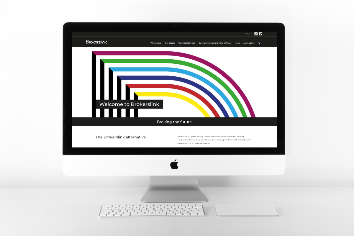
Our rebrand positions Brokerslink as a family of broking businesses yet demonstrates the flexibility of the partners; a balance between autocracy and autonomy.
The logotype is clean and sharp.It is contemporary yet durable. At first sight it looks rather simple. But it is how it is used that transforms it into a visual expression of what Brokerslink stands for.
The logo is black and white when used centrally but when used as an endorsement by the Brokerslink family, it breaks free. Each partner can coat the new logo in their own colours. They now endorse their brands without clashing with their corporate style.