Adding coherence
Apollo came to us looking to revamp its website, but we saw there was a bigger opportunity.
The branding was fragmented, with conflicting logos across different business divisions, causing market confusion. It didn’t accurately represent who it is or capture the energy and innovation behind its exciting business.
We advised a bold, unified approach, consolidating under the Apollo name with a single, striking logo. By modernizing the logotype and introducing a vibrant color gradient, we delivered instant impact.
To elevate the branding, we also developed a graphical support system inspired by spaceflight, using trajectory patterns to symbolise the significance of Apollo’s foundation in a fresh, unconventional way.
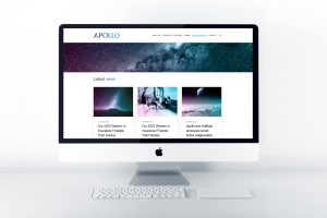
The renewed branding has been implemented across all of Apollo’s marketing material. Our work has unified Apollo’s identity, positioning them
as one cohesive group.


