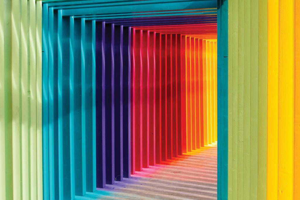
Colour is everywhere. It’s such an intrinsic part of our day-to-day experiences. If you take the time to assess your emotional response to colour, you might discover that certain colours affect and influence your behaviour more than you think.
Take a logo; it can be made up of several elements such as shapes, symbols, and type. But according to a recent report, the number one visual component people remember is colour. Colours increase brand recognition by 80%.
While perceptions of colour are subjective, some colours have a universal meaning and evoke emotional responses across the board. So how can certain colours effect your mood?
Red: Red attracts the most attention and is associated with strong emotions, such as love, passion, and anger. Used in branding, it can deliver an impactful punch with the ability to increase desire.
Yellow: A friendly, and often playful colour. It is the most visible colour from a distance and communicates cheerfulness, friendliness, joy, and energy. However, in the wrong context, yellow can also mean danger or ‘hazard’.
Blue: Blue is the colour of trust, serenity, and peace. It suggests loyalty and integrity as well as trustworthiness and communication. The downfall of blue and especially navy is that it can seem conservative or denote a rigid outlook.
Orange: Blending the warmth of red and the optimism of yellow, orange communicates activity and energy. Orange is a naturally invigorating and its vibrance is well suited to youthful energetic brands.
Green: Green is a versatile colour that often symbolises nature and the natural world, but other common associations can be money, good luck, health, envy, and jealousy. Be careful when picking what green to use as brighter, lighter greens indicate growth, vitality, and renewal while darker, richer greens represent prestige, wealth, and stability.
Purple: Purple combines the calm stability of blue and the fierce energy of red, it is considered a low arousal colour. It is traditionally associated with royalty, nobility, luxury, power, and ambition as well as having a spiritual or mysterious quality.
When choosing colours for your brand think about the emotions you are trying to draw out, and how you want your audience to respond. By choosing the right colour combination, you can help your brand leave a lasting impact that creates a more powerful connection with your audience.
The importance of colour interaction
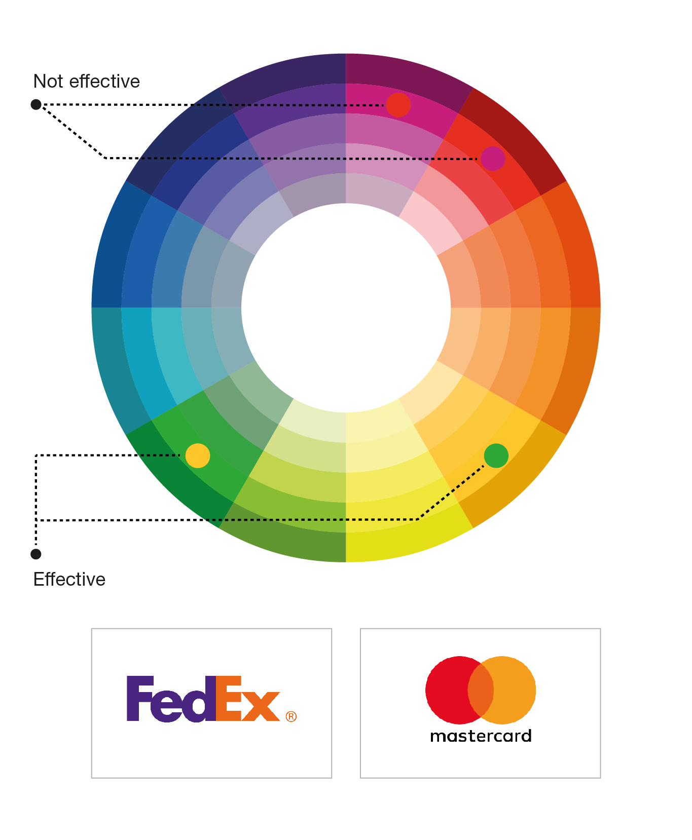
So now that we know colours have an impact on our emotions, we need to understand how colours complement each other. By using the basics of colour theory, which is essentially the science behind how we mix and apply colours, we can create a logical structure for grouping colours together. For this we’ll need to look at the colour wheel.
The colour wheels below show you how colour combinations relate to each other. It visually demonstrates the relationship between primary, secondary, and tertiary colours. You can use the colour wheel to develop different colour schemes.
The primary colours in the wheel are red, yellow, and blue, and these can be used to create secondary colours (orange, green, purple). By mixing primary and secondary colours we get tertiary colours – red-orange, yellow-orange, yellow-green, blue-green, blue-purple, and red-purple.
Complementary colour combinations
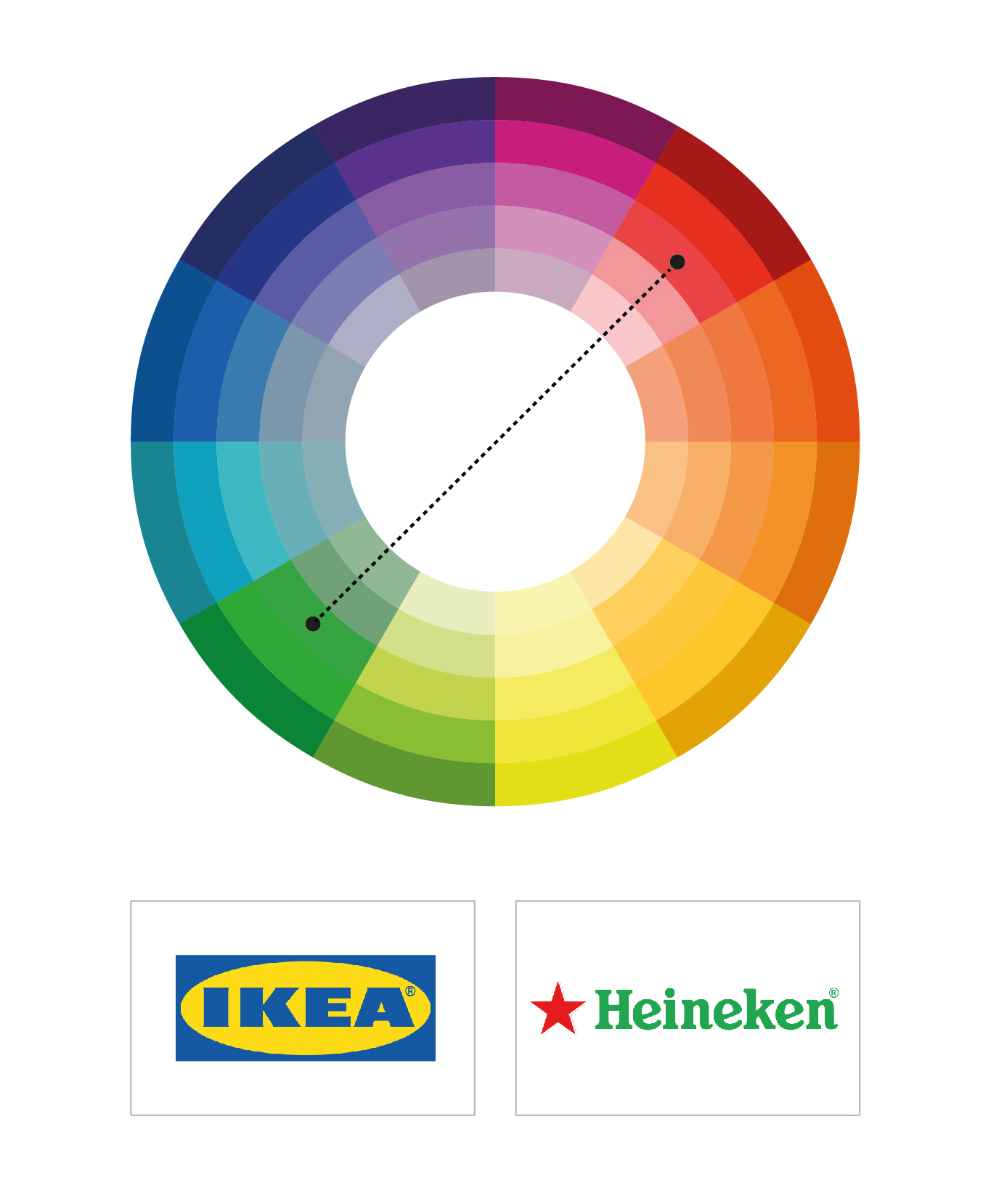
These colours can be found on the opposite sides of the colour wheel, such as blue and yellow or red and green. Used together, the colours appear brighter.
Monochromatic colour combinations
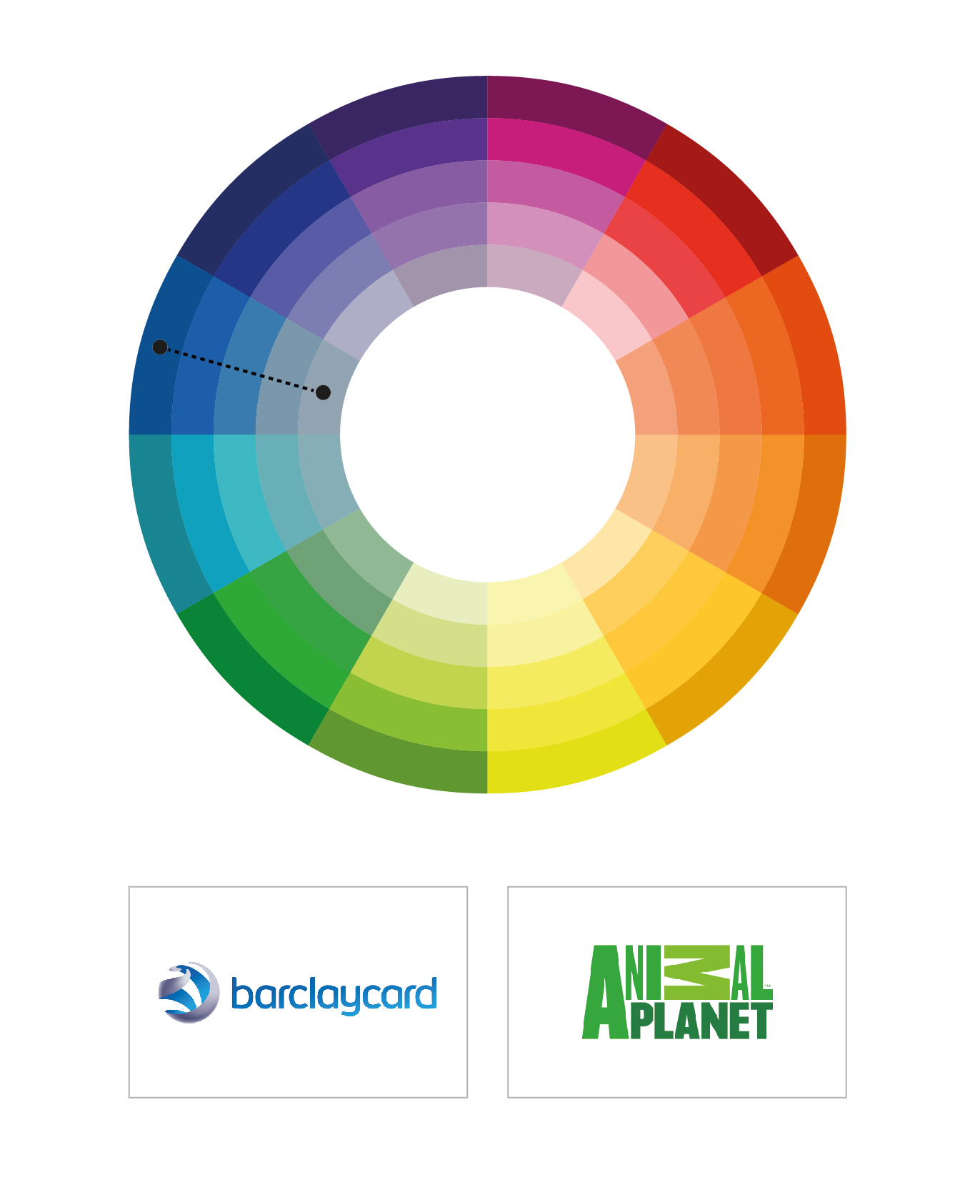
This is a variation of a single colour. Monochromatic schemes are serene and relaxing. Light tones create a relaxed delicate feel, whereas dark tones can feel moody and dramatic.
Triadic colour combinations
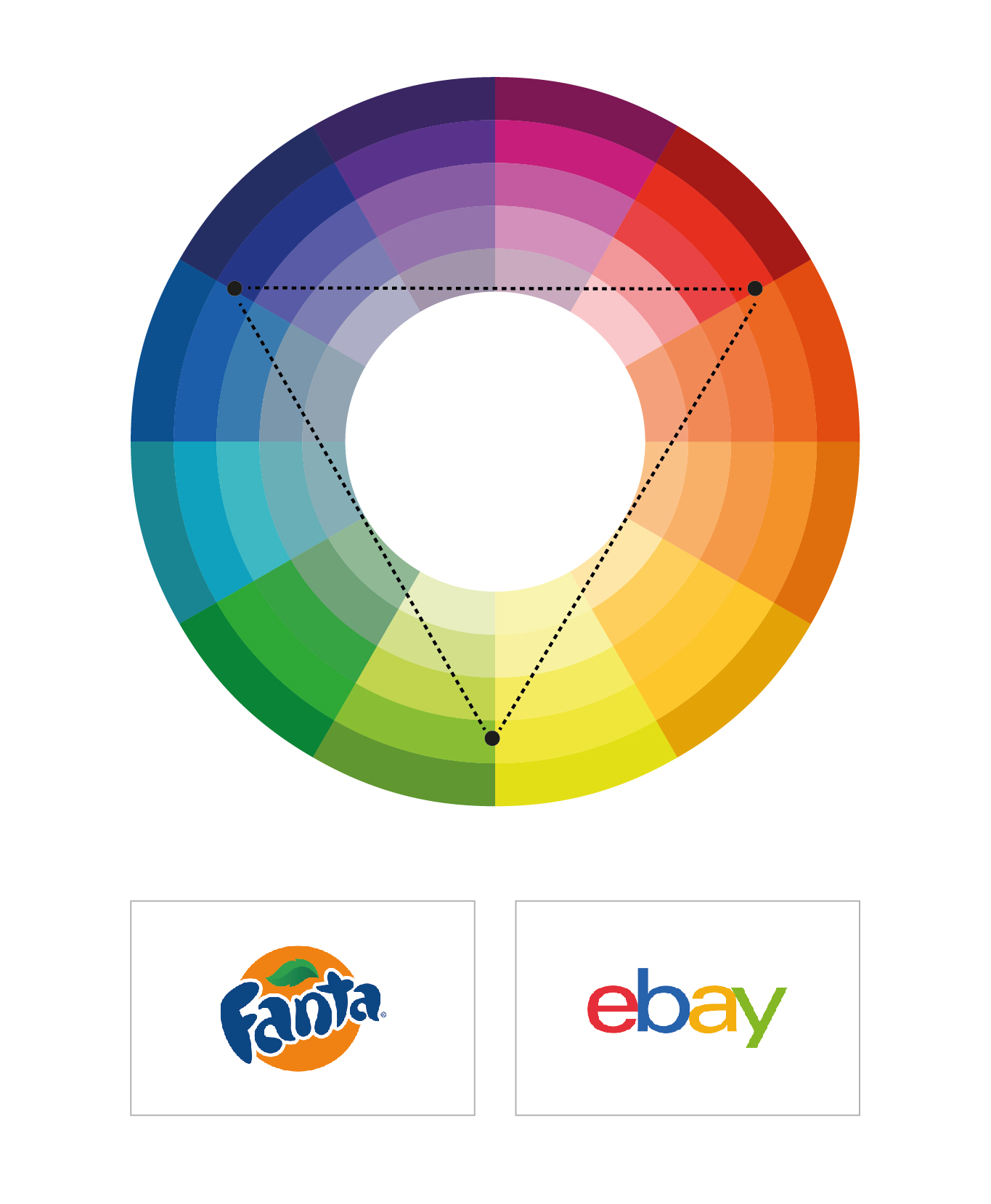
A triadic colour combination is a combination that uses three colours. They are equal distance on the colour circle, making the shape of a triangle. The results are harmonious but are a little more vibrant.
Contrasting colour combinations
Colours that are not in the same colour “family” or that aren’t exactly harmonious can work very well together. The overall impact can be quite striking.
The crucial thing to remember is that figuring out how to create a colour palette that’s perfect for your brand takes time. You might need to experiment but once you’re happy you need to stick with it. A colour palette needs to stay consistent throughout the life of your brand to aid in brand recognition and awareness.
If you’d like to know more or need guidance through the process of choosing the right colours that best represent your brand colours, get in touch.